Redesigning the Digital Backbone of Substation Maintenance
Field research, expert sessions, and a redesign built around how substation engineers actually assess risk.
Challenge
RelCare is Hitachi Energy's digital platform for managing the maintenance of power substation assets like transformers, circuit breakers, and protective relays. The existing interface presented dense engineering data in flat, scrollable card layouts with no hierarchy. Field engineers and maintenance managers struggled to quickly identify which assets needed attention, buried under screens of raw characteristics and void values.
Solution
Through user interviews and deep domain expert collaboration, I uncovered the hierarchical mental model engineers actually use: asset to subsystem to characteristic. This insight transformed the entire design direction, replacing flat data grids with a drill-down architecture, from health monitoring through field maintenance execution.
A platform that keeps the lights on
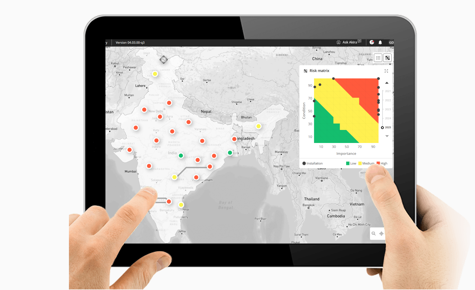
RelCare is Hitachi Energy's digital platform for managing power substation maintenance: transformers, circuit breakers, protective relays. The kind of infrastructure where a missed warning can black out a city.
The platform covers four steps: risk monitoring, maintenance engineering, maintenance planning, and maintenance execution. Users are field engineers and asset managers working under time pressure across remote installations, who need the right information surfaced fast.

Understanding engineers from a distance
Users are spread across substations in different geographies. We combined two research approaches: user interviews with engineers, maintenance managers, and field leads, and camera recordings of engineers carrying out actual maintenance on-site, capturing how they physically moved between assets, referenced paper checklists, and made decisions in context.
Seeing the real workflow (not a recalled version of it) surfaced insights that interviews alone never would. We supplemented these with domain expert sessions with engineers who had spent decades in the field.
You can't just show someone a list of numbers and expect them to understand what's happening inside a transformer. They need to see the story the data is telling — which subsystem is degrading, how fast, and what it means for the next maintenance window.
Key findings
Four problems surfaced consistently, each a gap between how the interface presented data and how engineers actually think.
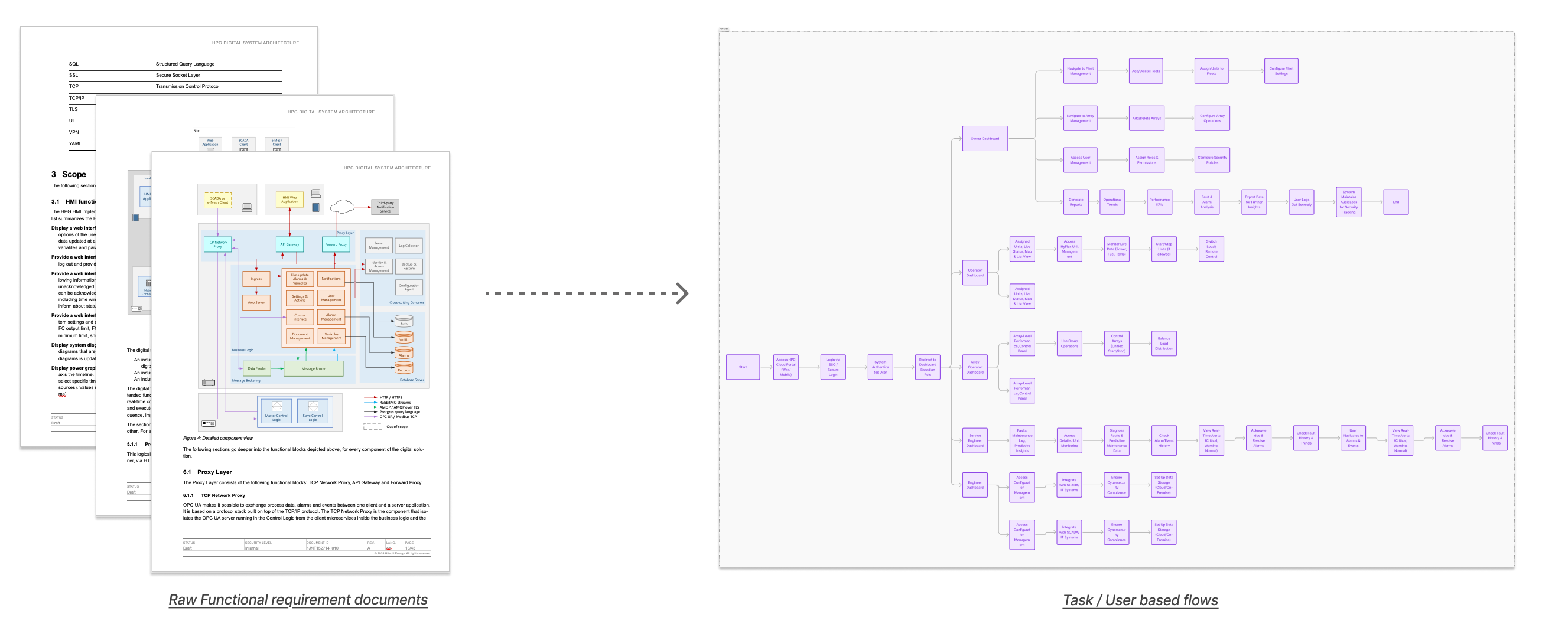
From requirements to task flows
We translated dense functional requirement documents into user-centered task flows, restructuring technical specifications around what engineers actually need to do.
A flat interface for hierarchical thinking
The existing Health Score interface presented all 50+ characteristics at the same visual level: no hierarchy, no summary, no way to scan. Subsystem cards extended off-screen to the right. Most values were null for any given asset type, burying the 6–8 that actually mattered under a wall of irrelevant fields.
Engineers had built their own workaround: mentally grouping data by subsystem before they could even begin assessing an asset. The interface was making them do the structure's job.
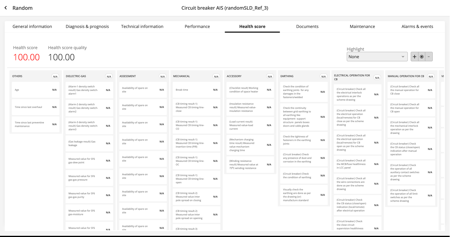
I don't look at 50 numbers. I look at six subsystems. If one is red, I go deeper into it. If they're all green, I move on to the next asset. That's how every experienced engineer works.
From mental model to interface
The challenge: preserve the simplicity of "six subsystems, drill deeper when needed" while handling 50+ characteristics per asset.
Layout restructuring
Establishing the core information hierarchy. Top section for overall health score with gauge, trend chart, and recommendation count. Bottom section for subsystem breakdown with drill-down capability. This was the first wireframe to reflect the hierarchical structure engineers described in research.
Tree view exploration
Testing a tree-based navigation pattern for the subsystem hierarchy. Left panel shows expandable subsystem nodes with health scores. Right panel shows characteristic details for the selected subsystem. This directly mirrors how engineers mentally navigate from asset to subsystem to characteristic.
Data density refinement
We tested the tree view against real asset data to find its density limits. Each characteristic row gained sparkline trends, quality indicators, and recommendation badges. The question was whether the layout could hold up at 50+ characteristics without becoming what we were trying to replace.
The solutions, in detail
Three modules, each requiring a different kind of design thinking.
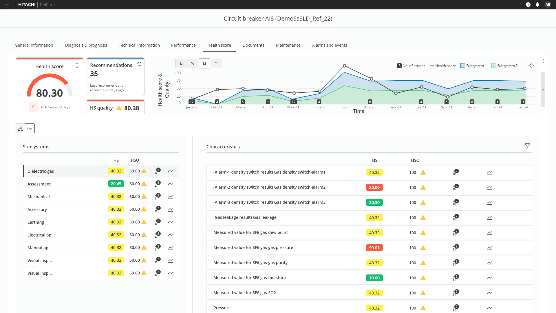
Health Score: Summary panels + subsystem drill-down
Replaced flat cards with a split layout: subsystem list on the left with color-coded health scores, characteristic details on the right. Engineers scan six subsystems in seconds and drill deeper only when needed.
The redesigned Health Score page showing subsystem list on the left with color-coded health scores, and characteristic details on the right with individual scores, quality indicators, and trend sparklines.
Hierarchical tree view showing the full breakdown from asset to subsystem to individual characteristics, with expandable nodes and inline status indicators.
Asset detail: Progressive disclosure at scale
Asset detail pages manage 50+ characteristics across General, Assessment, Auxiliary, Rating, and Data Sheet categories. The old interface showed everything at once.
The redesign introduced collapsible accordion sections. Engineers land on five clean headers and expand only what they need. Each section adapts its layout to the content type: key-value grids for General, deviation flags for Assessment, dropdown selects for Data Sheet.
Clean starting state with five collapsible sections. Engineers see the full structure at a glance and expand only what they need, without wading through 50+ data fields at once.
The General section expanded showing a two-column key-value layout with an image gallery sidebar. Other sections remain collapsed, keeping the page focused.
I can see the health of all six subsystems at once. Before, I had to scroll through everything and build the picture myself.
Before and after
- ✗ All 50+ characteristics at the same visual level
- ✗ Horizontal scrolling required to see all subsystems
- ✗ No subsystem-level health summary
- ✗ Null values creating visual noise everywhere
- ✓ All six subsystems scored at a glance: Dielectric, Mechanical, Earthing, Electrical Operations, Assessment, Accessories
- ✓ Drill-down from subsystem to characteristics
- ✓ Color-coded health scores for instant scanning
- ✓ Trend sparklines showing health trajectory
Validation and impact
Validated through structured usability sessions with 4 of the engineers interviewed during discovery. The same people who'd described the problems, now evaluating whether the designs solved them.
The interface finally matched the way the work actually gets done. Engineers stopped asking us to explain the layout. They just used it.
Key improvements
- Engineers can assess all six subsystems in a single view. No horizontal scrolling, no mental reconstruction.
- The subsystem-to-characteristic structure replaced flat cards, aligning the interface with how engineers already think about assets.
- Collapsible sections replaced the all-at-once data dump. Engineers expand only what they need.
- The tree view filters out null fields, surfacing only the characteristics that matter for each subsystem.
What I learned
Analysing camera recordings of engineers doing actual maintenance, combined with interviews and expert sessions, gave us depth we couldn't have reached any other way. The recordings showed what engineers did, not what they remembered doing. That gap matters more than you'd think.
The most valuable insight surfaced during a collaborative working session, not a formal interview. A domain expert talking through the problem unprompted gave us the hierarchy model that shaped everything. Good research conditions matter as much as good questions.
Designing across both modules meant the same mental model (asset to subsystem to characteristic) ran consistently from Health Score through to Asset Detail. That consistency didn't happen by accident. Fragmented ownership is usually where it breaks down.